Bar graph maker
Paste spreadsheet data to make a single, grouped, or stacked bar chart. Choose vertical or horizontal bars, download SVG or PNG, and print blank worksheets. Free, with no sign-up.
Blank bar graph worksheets
Print blank bar chart grids for practice, classroom exercises, or manual graphing assignments. Includes name and date lines.
Bar graph examples
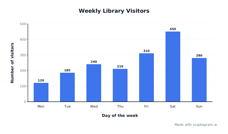
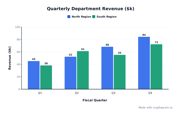
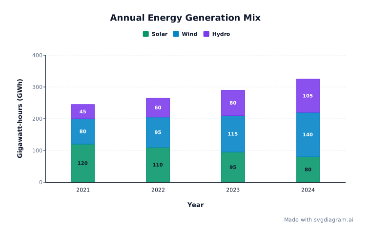
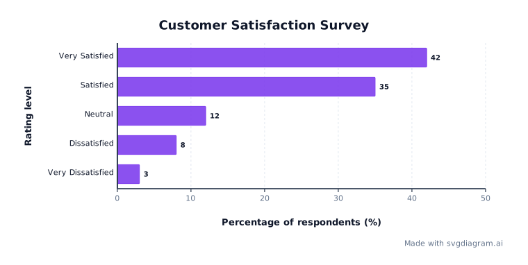
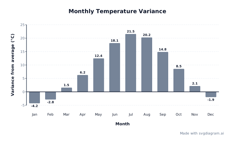
Open worked examples including weekly visitors, quarterly department sales, annual energy mix, survey results, and temperature variance.
How to read and build a bar graph
What a bar graph shows
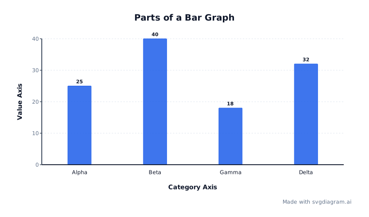
A bar graph (or bar chart) uses rectangular bars to compare discrete categorical data across named categories. The length or height of each bar is directly proportional to the numerical value it represents (NCES).
Unlike histograms, which group continuous numerical data into adjoining ranges (bins), bar graphs display distinct categories separated by gaps. Use a bar graph to compare counts, revenue, survey scores, or measured quantities across departments, time periods, or test groups.
Single, grouped, and stacked bar charts
Bar graphs support three distinct layout modes depending on how many data series you need to compare:
- Single bar chart: Displays one bar per category. Ideal for comparing single values across categories, such as weekly visitors, test scores by subject, or monthly rainfall.
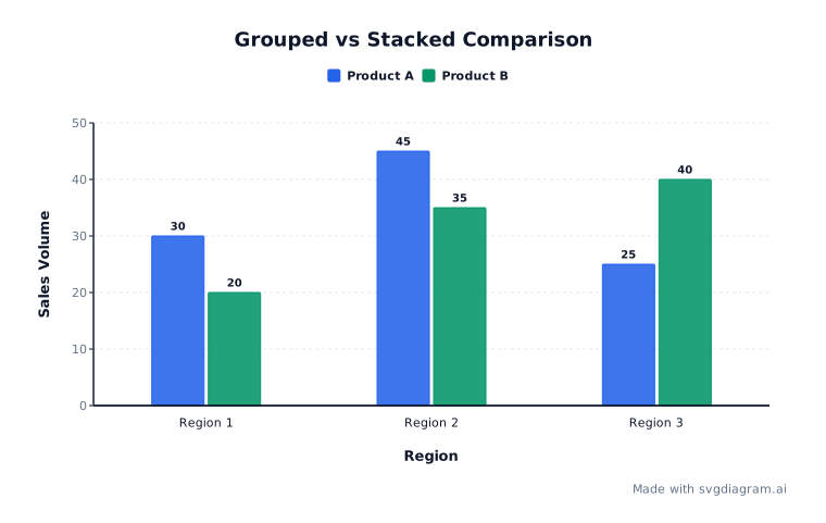
- Grouped (double) bar chart: Places bars side by side within each category. A double bar graph compares two series; this maker supports up to six. Use it to compare regional sales across quarters or results from two classes.
- Stacked bar chart: Combines series into segments within each category. Use nonnegative values to show a total and its parts. Upper segments do not share a baseline, so grouped bars are better for comparing individual series. Signed stacks accumulate positive and negative values separately from zero; their full span is not the net total.
Vertical vs horizontal orientation
Vertical bar graphs place categories along the horizontal X-axis and values along the vertical Y-axis. Horizontal bar graphs place categories along the vertical Y-axis and values along the horizontal X-axis. Use horizontal orientation when category names are long or when displaying ranking lists.
Baseline honesty and zero alignment
The numerical axis always includes zero: bar length represents the value, so cutting off the baseline changes the apparent proportions. Negative values extend in the opposite direction from zero. Label the units so readers know whether a value means people, dollars, percentages, or another quantity (NCES graph guide).
How to create and export bar graphs
- Paste or enter data: Paste CSV or tab-separated spreadsheet data with a header row, such as
Month,Class A,Class B. The first column names categories; the remaining columns name one to six series. Series names must be distinct. Up to 30 categories are supported. The examples use illustrative data, not published measurements. - Choose graph settings: Toggle between single, grouped, or stacked modes and vertical or horizontal orientation. Turn value labels or grid lines on or off. Specify custom axis maximum or step values if needed.
- Customize appearance: Select a color palette, font family, text size, and background. For classroom practice, toggle worksheet mode to generate blank grids with name and date lines.
- Export and share: Download high-resolution SVG or PNG images, copy a share link with exact state restored, or print blank practice worksheets directly from your browser.
Every row needs a value for each series. Missing cells are not treated as zero. Decimal and scientific notation are supported, but not fractions or thousands separators: enter 1000, not 1,000. Values must be between minus one billion and one billion; nonzero magnitudes below 0.000000000001 are not supported. Category and series names can contain up to 80 characters. Invalid data stays visible and blocks image exports until corrected.
Titles support up to 120 characters, and axis labels up to 80. Custom axes can have at most 100 ticks. If a stacked segment is too small for its value label, turn off value labels or use grouped bars. Ranges that would make a nonzero bar unreadable are rejected rather than drawn with an exaggerated minimum size.
Explore other diagram types
Templates for each type, filled in from a description of your content.