Box plot maker
Paste numeric datasets, compare side-by-side box and whisker plots, adjust quartile methods and 1.5×IQR outlier fences, and download SVG or PNG. Free with no account required.
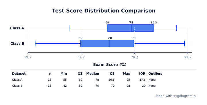
Blank box plot worksheets
Print blank box plot worksheets for classroom practice and homework assignments. Includes student name and date headers.
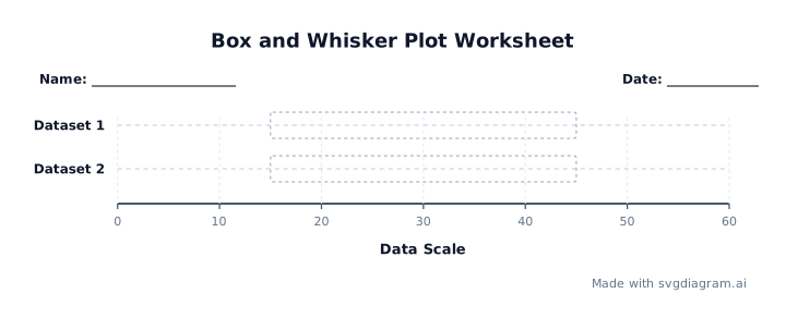 Box and Whisker Plot WorksheetOpen
Box plot examples
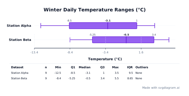
Open worked examples demonstrating side-by-side group comparisons, 1.5×IQR outlier detection, negative temperature ranges, or quartile calculation methods.
How to read a box plot
What a box plot shows
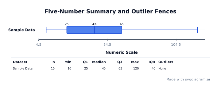
A box plot (also called a box-and-whisker plot) summarizes a dataset's distribution using its five-number summary: minimum, first quartile (Q₁), median (Q₂), third quartile (Q₃), and maximum (CDC Data Visualization Guide).
The central rectangle (the "box") spans the interquartile range (IQR = Q₃ − Q₁), containing the middle 50% of the observations. A line inside the box marks the median. Lines called "whiskers" extend outward from the box to indicate variability outside the upper and lower quartiles.
Box plots are ideal for comparing distributions side-by-side across multiple groups or categories without making assumptions about underlying statistical normality.
Quartile calculation conventions
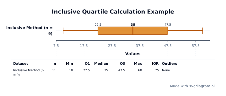
Different statistical packages use different methods to compute quartiles Q₁ and Q₃, especially when dataset size n is odd (NIST Handbook on Percentiles). This maker supports two explicit quartile conventions:
- Median-halves (exclude middle value, default): Divides the ordered observations into lower and upper halves around the median. If n is odd, the overall median is excluded from both halves. Q₁ is the median of the lower half, and Q₃ is the median of the upper half.
- Inclusive method (Linear interpolation): Computes percentiles using continuous rank position h = (n − 1) × p. Q₁ corresponds to p = 0.25 and Q₃ to p = 0.75, linearly interpolating between adjacent rank values.
Worked example of quartile differences and outlier fencing
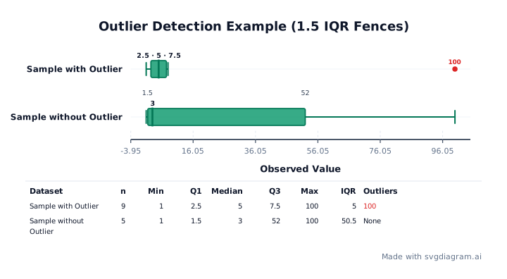
Consider the dataset [1, 2, 3, 4, 5, 6, 7, 8, 100] (n = 9):
- Median: 5 (the 5th value).
- Lower half:
[1, 2, 3, 4]→ Q₁ = 2.5. - Upper half:
[6, 7, 8, 100]→ Q₃ = 7.5. - IQR: 7.5 − 2.5 = 5.0.
- Outlier fences (1.5 × IQR):
- Lower fence: 2.5 − 1.5 × 5 = −5.0.
- Upper fence: 7.5 + 1.5 × 5 = 15.0.
- The observation
100exceeds the upper fence of 15.0, so it is plotted as an explicit red outlier point. The upper whisker stops at8(the largest observation ≤ 15.0).
Now consider [1, 2, 3, 4, 100] (n = 5):
- Median: 3.
- Lower half:
[1, 2]→ Q₁ = 1.5. - Upper half:
[4, 100]→ Q₃ = 52.0. - IQR: 52.0 − 1.5 = 50.5.
- Upper fence: 52.0 + 1.5 × 50.5 = 127.75.
- Because
100is less than 127.75, under median-halves100is not flagged as an outlier for this small sample size.
How to use the box plot generator
- Enter observations: Paste raw numeric observations for up to 6 datasets. Enter values separated by commas, spaces, or newlines. Negative values and decimals are fully supported.
- Choose conventions: Select your preferred quartile method (Median-Halves or Inclusive) and whisker reach (1.5×IQR fences or Min-to-Max).
- Customize axis and labels: Set custom axis minimum, maximum, and step values if needed, or leave blank to calculate optimal automatic scale bounds. Add custom titles and horizontal axis labels.
- Export or print: Download high-resolution vector SVG or raster PNG images with embedded fonts. Enable Worksheet mode to print blank box plot grids for student exercises.
Explore other diagram types
Templates for each type, filled in from a description of your content.