Histogram maker
Paste numbers, adjust the bins, and see how your data is distributed. Download SVG or PNG, or print a blank worksheet. Free, with no account.
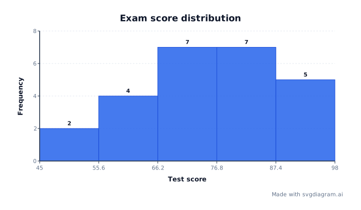
Blank histogram worksheets
Print an empty-column frequency grid for equal-width, negative, or decimal bins. Name and date lines are included.
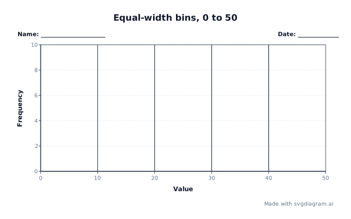
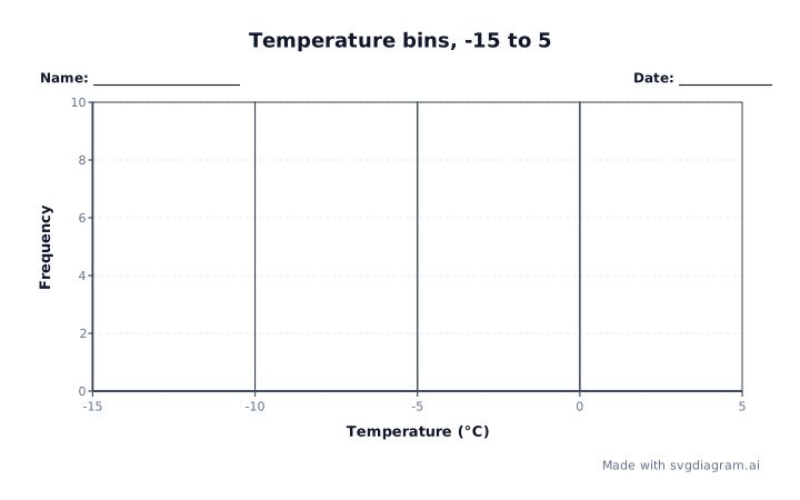
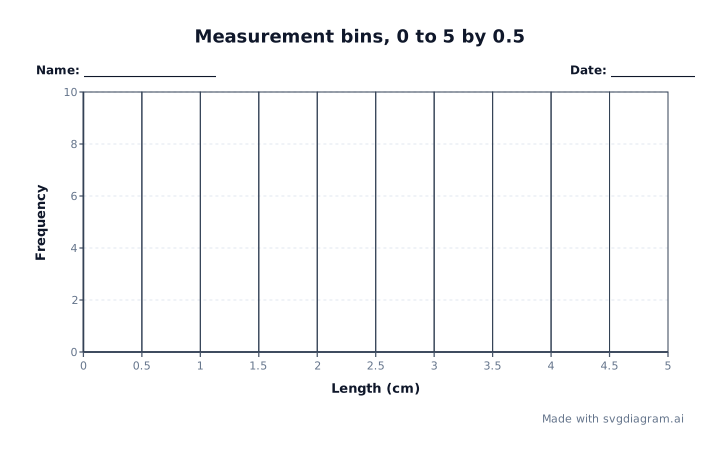
Histogram examples
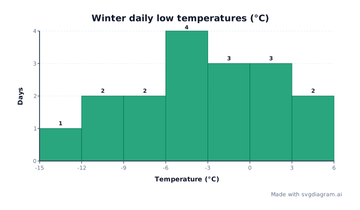
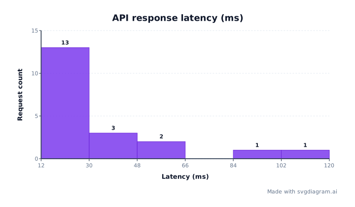
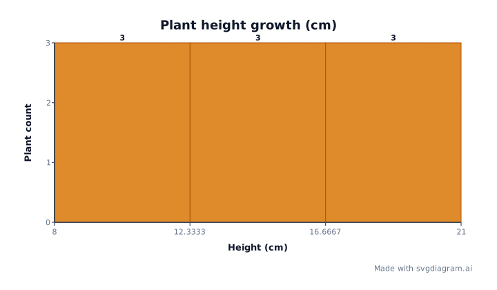
Open worked examples including exam scores, daily temperatures, server latency, or small data sets.
How to read a histogram
What a histogram shows
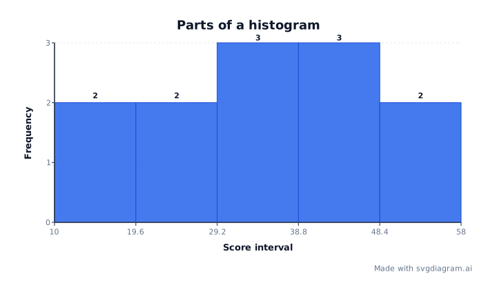
A histogram groups numbers into ranges called bins. Each bar shows how many observations fall in its range. The horizontal axis shows the numeric ranges; the vertical axis shows frequency, or count. Bars touch because the ranges are adjacent.
Use a histogram to see where test scores, temperatures, or response times cluster, how spread out they are, and whether there are several peaks or a long tail (NIST). Use a bar chart instead when comparing named categories, such as sales by department. Numeric ranges and categories answer different questions (Cooper & Shore).
Bin selection and boundary conventions
Wide bins can hide differences; narrow bins can make a small sample look noisy. Try more than one width before drawing conclusions. Automatic binning is a starting point, not proof that one grouping is best (NIST on bin width). This maker uses equal-width bins and counts, not probability density.
- Auto: Takes the square root of the observation count, rounds up, and caps the result at 60 bins.
- Fixed count: Divides the range into 1–60 equal-width bins. Identical observations get a nonzero display range so the chart remains readable.
- Fixed width: Uses the width you enter. Set a bin start to choose the boundaries yourself. If left empty, the start is half a bin width below the smallest observation.
Which bin owns a boundary value?
Each bin includes its lower edge and excludes its upper edge, except the final bin, which includes both. For example, with edges 0, 2, and 4, the values 1, 2, 2, 3, 4 give counts of 1 and 4: both twos belong to the second bin, as does the final four.
This is the same endpoint rule used by NumPy, but other software may choose different conventions. Check the rule when comparing results.
How to create and export histograms
- Paste the individual observations, not a table of precomputed frequencies. Spaces, commas, tabs, and line breaks separate values. Omit headers and thousands separators: write
1000, not1,000. One number per line is the clearest format. - Choose automatic bins, a fixed count, or a fixed width. Negative values, decimals, and scientific notation are accepted within the supported limits: 10,000 observations, magnitudes up to one trillion, and numeric resolution of one trillionth.
- Add a title and axis labels, including units. Choose the font, colors, and text size.
- Download SVG or PNG, or copy a link to reopen your settings. For classroom practice, open a blank worksheet and print it or save it as PDF. The sheets give empty columns on an equal-width, negative, or decimal scale. They omit solved bars and counts.
Explore other diagram types
Templates for each type, filled in from a description of your content.