Pie chart maker
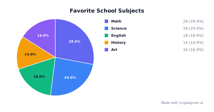
Create custom pie charts and donut charts with category and numerical data. Customize colors, fonts, and percentages, or download SVG, PNG, and printable worksheets. Free, with no account required.
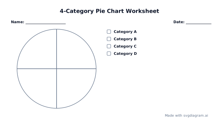
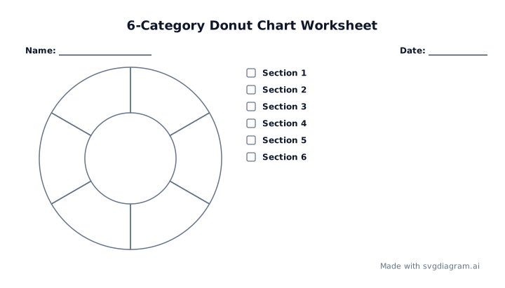
Blank pie & donut chart worksheets
Print blank pie and donut chart templates for practice, classroom exercises, or hand-drawn plotting.
Pie chart examples
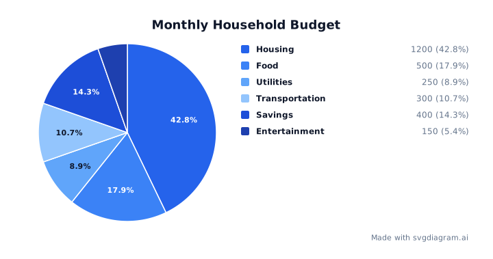
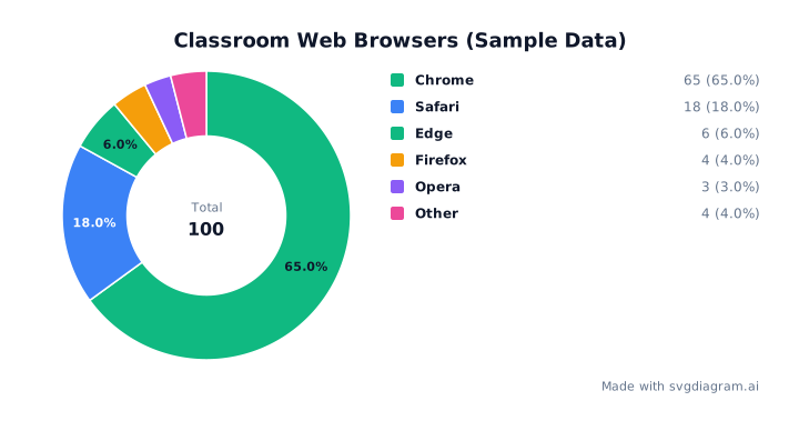
Explore worked pie and donut chart examples covering school surveys, household budgets, and classroom web browser data.
Understanding pie and donut charts
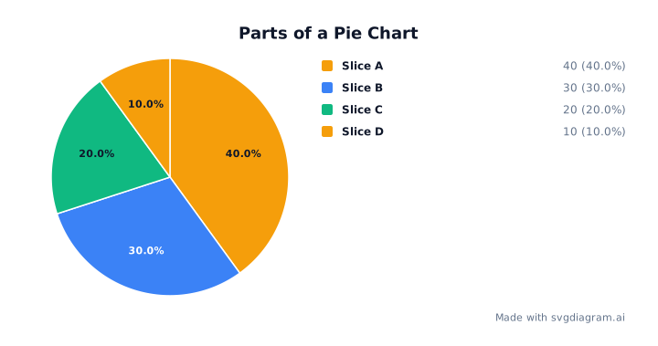
A pie chart represents categorical data as proportional slices of a circle. The entire circle represents 100% of the total dataset, and each category's slice angle is calculated directly from its numerical proportion:
Slice angle = (Category Value ÷ Total Value) × 360°
Percentages are rounded to one decimal place using the largest-remainder method so that the sum of all category percentages always equals exactly 100.0%.
Use a pie chart when the categories form one whole. The Government Analysis Function chart guidance recommends no more than five categories; use a bar chart when values are close and small differences matter. This maker accepts up to 24 categories, but that is an input limit, not a recommendation. Slices follow your input order clockwise from 12 o'clock. All worked examples use fictional practice data.
Pie charts vs. donut charts
Both pie charts and donut charts display relative proportions. A donut chart has a hollow center:
- Pie Charts: Use solid circular sectors. Slices meet at the central origin, making area and central angle comparison intuitive for classic datasets.
- Donut Charts: Remove the central region, transforming sectors into circular arcs. The center hole can display high-level summary metrics (such as the grand total), guiding the reader's eye along the outer arc lengths.
Donut charts provide a clean, modern aesthetic for dashboard reports, while classic pie charts remain a staple in elementary statistics and classroom mathematics.
How to create, customize, and export pie charts
- Enter Category Data: Type or paste your category labels and non-negative numerical values into the data input area. You can separate labels and values with commas or tabs (one category per line, e.g.
Math, 28). Headers likeCategory, Valueare automatically detected and skipped. - Choose Chart Type: Toggle between a solid Pie chart or a hollow Donut chart. When donut mode is selected, adjust the inner radius slider to set the donut hole proportion.
- Customize Display & Styling: Add a descriptive chart title. Choose from hand-crafted color palettes, font families, text sizes, and background fills. Toggle percentage labels and raw value displays on or off.
- Export & Print Worksheets: Download high-resolution vector SVG or PNG images for your reports, presentations, or assignments. Use Worksheet Mode or select a blank template to print unfilled practice charts for classroom activities.
Explore other diagram types
Templates for each type, filled in from a description of your content.