Scatter plot maker
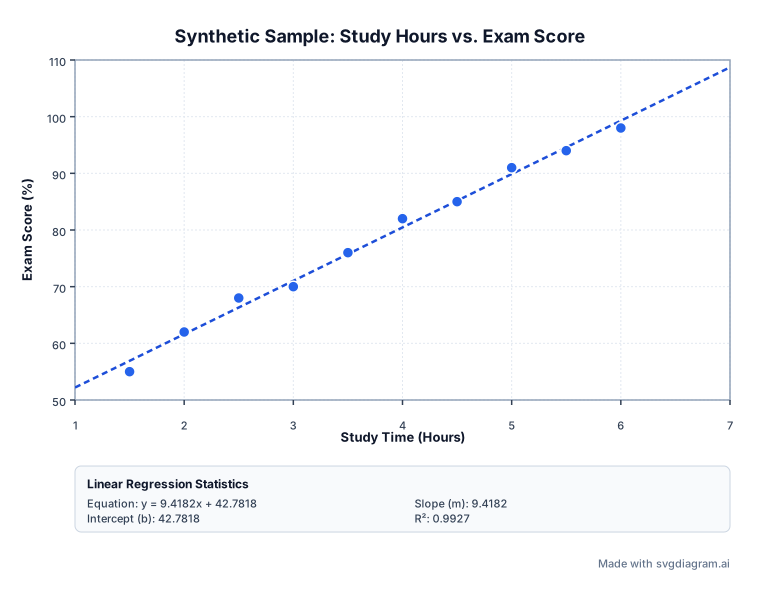
Create custom scatter plots with paired numeric data. Calculate linear trendlines, slope, intercept, and R², print blank worksheet grids, or export high-resolution SVG or PNG images. Free, with no account required.
Format: x, y[, label] or tab-separated. Up to 500 rows. Headers like x,y,label are automatically skipped.
Blank scatter plot worksheets
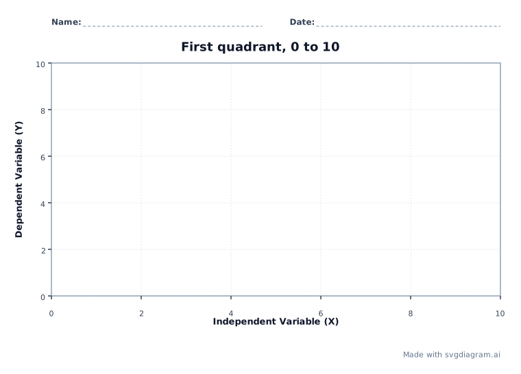
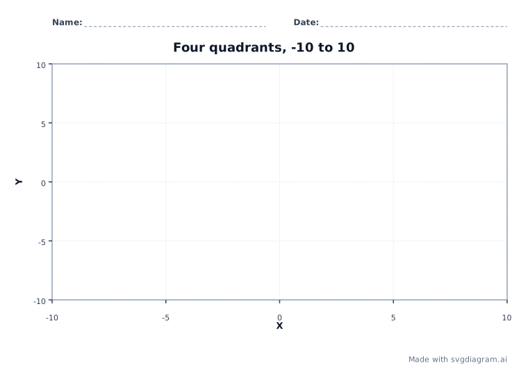
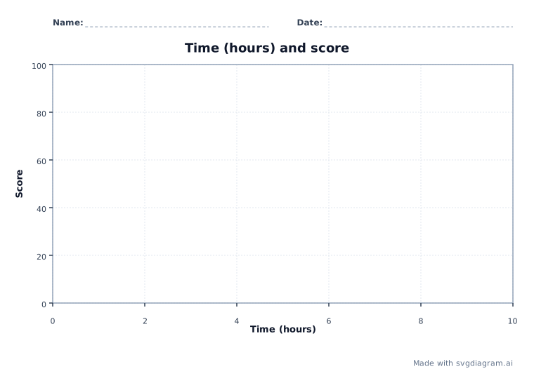
Print a first-quadrant, four-quadrant, or hours-and-score grid. Name and date lines stay; points, trend lines, and statistics do not.
Scatter plot examples
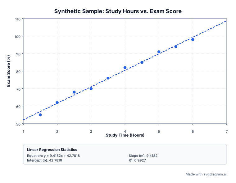
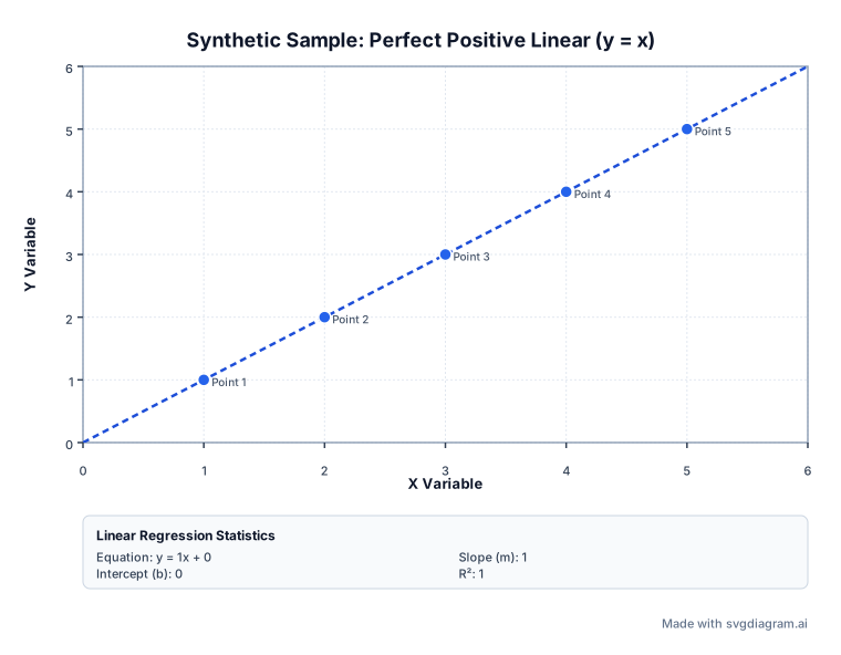
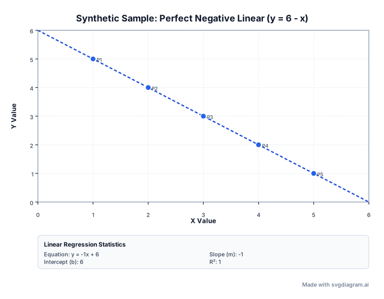
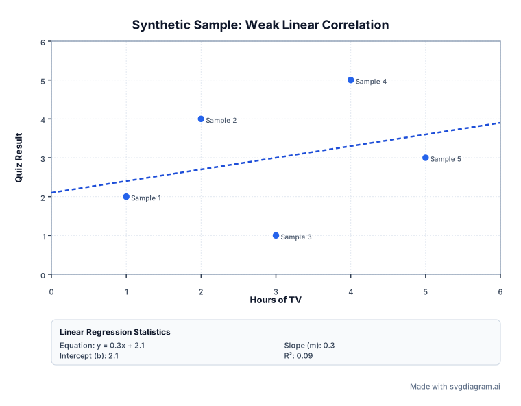
Explore worked scatter plot examples showing positive, negative, and weak linear correlations.
What a scatter plot displays
A scatter plot shows each pair of numbers (x, y) as a point. Use it to look for trends, clusters, curved patterns, and outliers between two numeric variables. The NIST scatter plot guide illustrates these patterns.
The horizontal axis shows X and the vertical axis shows Y. Keep each pair together when pasting data: changing their order changes the chart. You can treat X as a predictor and Y as an outcome, but a pattern alone does not show that X causes Y.
Linear regression and ordinary least squares
When evaluating linear trends, the generator computes a simple linear regression model y = mx + b using ordinary least squares (OLS). As detailed in the NIST handbook on OLS estimation and Penn State STAT 462, ordinary least squares calculates the line of best fit by minimizing the sum of squared vertical distances (residuals) between each observed data point and the fitted line.
The slope m represents the estimated average change in Y per one-unit change in X, while the vertical intercept b represents the predicted value of Y when X = 0. All sample data points shown in presets are synthetic illustrations.
Understanding R-squared (R²) and limitations
The coefficient of determination, R², measures the proportion of total variation in Y explained by the linear relationship with X. An R² value of 1.0 indicates a perfect linear alignment, whereas R² = 0 indicates no linear correlation within the sample.
Important mathematical boundaries and statistical limitations apply:
- In-sample fit, not causation: R² describes how well the line fits these Y values. It does not show which direction the trend runs, establish cause and effect, or guarantee accurate predictions beyond the observed X values.
- Constant Y values: When all Y coordinates are identical, the best-fit line is horizontal (m = 0). Because total sum of squares is zero, R² is mathematically undefined.
- Constant X values: When all X coordinates are identical, the data cannot determine a unique slope for y = mx + b. The points still plot, but the maker does not report a fitted line.
- Outliers and non-linear patterns: An extreme point can pull the fitted line. A low R² can also hide a strong curved relationship, so inspect the points rather than relying on the statistic alone.
How to use the scatter plot generator
- Enter or paste data in CSV or TSV format with
x, yorx, y, labelcolumns. Up to 500 rows are supported. - Edit the chart title and custom axis labels to clearly define your variables.
- Toggle the linear trendline, statistics summary card, or point labels as needed for your presentation.
- Customize colors, font face, and text size. For classwork, open a blank worksheet on this page instead of turning a solved chart into an empty one by hand.
- Download high-resolution SVG or PNG images for inclusion in reports, slides, or publications.
Print a blank scatter plot worksheet
A blank worksheet keeps the title, axis labels, tick marks, and Name and Date lines. It does not plot points, draw a trend line, or show regression statistics. The axis runs from the smallest value in the data to the largest, and the tick labels stay inside that range, including both ends. The corner rows set that range; they are not answers on the sheet. Both axes need a positive range, so one point, or corners that share an X or a Y value, cannot make a grid.
Explore other diagram types
Templates for each type, filled in from a description of your content.