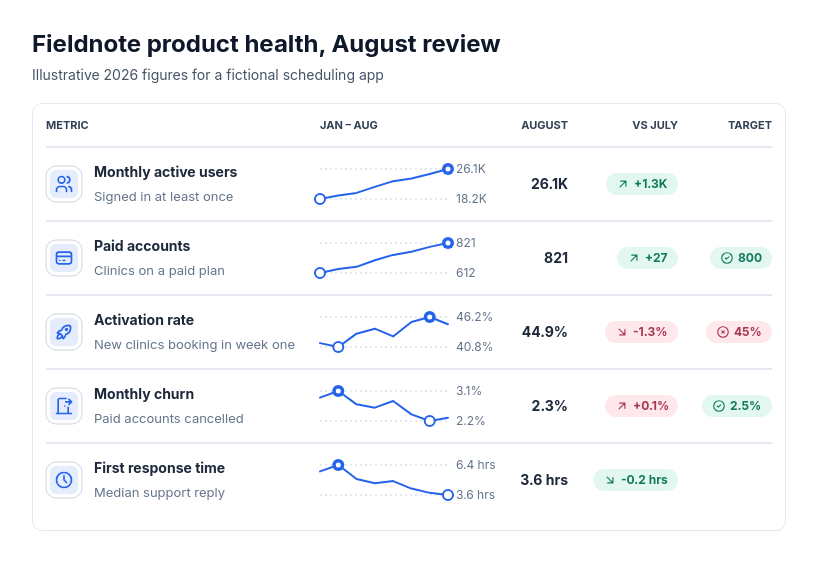
Diagram template
Stats: sparkline table
MaxOne aligned table panel with a header row and three to eight metric rows sharing one sequence of four to twelve periods. Each row shows an optional icon with the metric's name and description, an inline trend line scaled to that row's own lowest and highest values with both marked and labeled at its right end, the final period's value, a change pill against the previous period, and, when supplied, a target pill marked met or not met.
Categories
Included in
Max
When to use it
Use for a compact dashboard of several metrics with a short shared history: monthly KPI reviews, product health or support operations metrics, regional or channel sales summaries, board pack scorecards. Change and target colors appear only when a favorable direction is supplied. Each trend has its own scale, so rows show shape and range rather than comparing magnitudes. Not for one headline number, comparing series on one shared axis, metrics measured over different periods, or long histories.
Adjust after generating
Change the style, colors, and font, and these options, as often as you like without spending credits.
- Card shape
- Card fill
- Color distribution
- Card border
- Card shadow
- Typography
- Icon shape
- Icon size
- Icon fill
- Icon shell
- Spacing
- Material
What you fill in
Describe your topic in plain words and the AI fills these in. You can edit every field afterwards.
- Item label
- Text
- Value label
- Text
- Change label
- Text
- Target label
- Text
- Categories
- 4 to 12
- Metrics
- 3 to 8, each with label, optional description, values, optional prefix, optional suffix, optional better, optional target, and optional icon
Related templates
All stats templates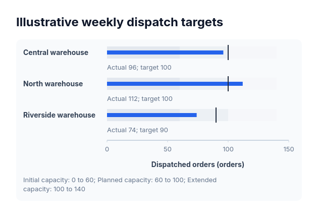 BulletActual-versus-target values sharing one nonnegative scale and explicitly supplied range boundaries.
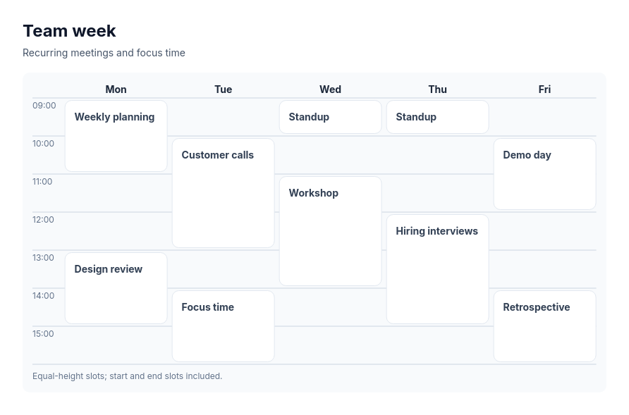 Calendar gridA schedule laid out by period and time slot, such as a week timetable, a conference day plan, a content calendar by week, or a weekly meal or workout plan, with events that occupy one or more consecutive slots.
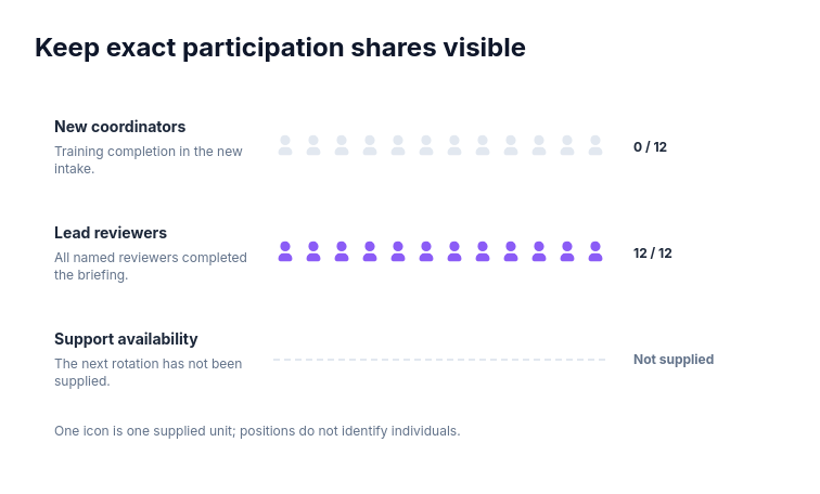 Chart: exact unit sharesFor program attendance, licensed accounts or project staffing expressed as small exact counts.
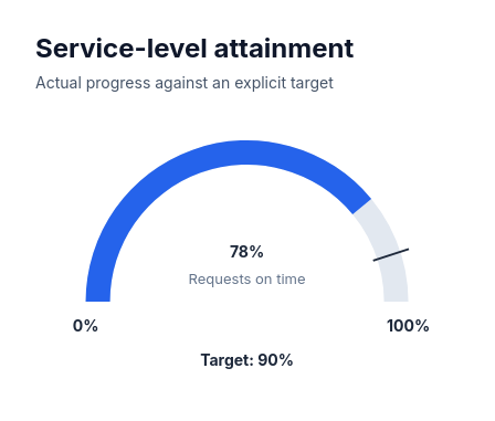 GaugeShow a supplied finite value on an explicitly bounded semicircular scale.
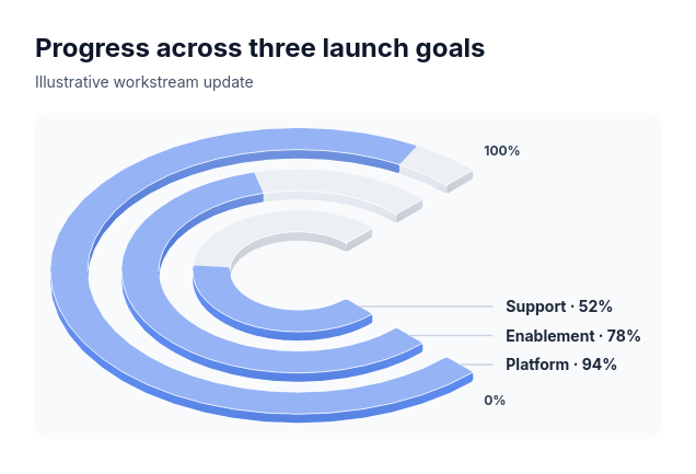 ProgressIndependent launch workstreams, fundraising targets, training completion or sustainability commitments.
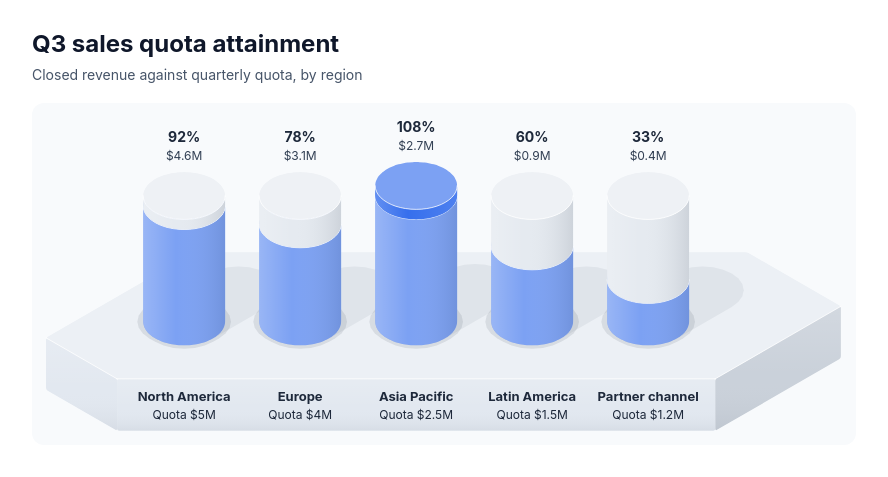 Progress chartSeveral measures each tracked against its own target, compared by the share reached: sales quota attainment by region or rep, fundraising toward campaign goals, OKR key results, migration or rollout completion, hiring against plan.