Diagram template
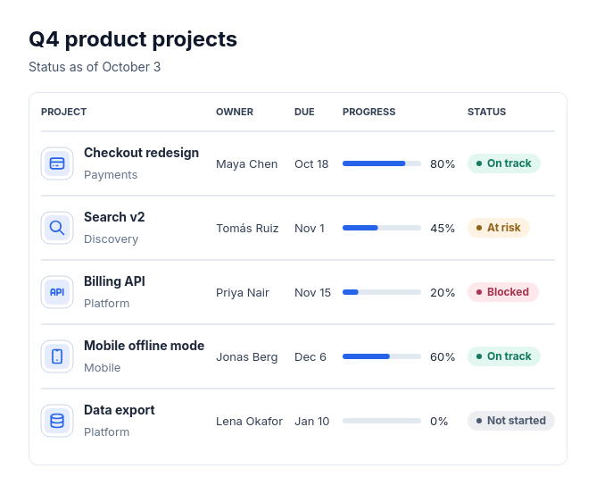
Status table
ProA table panel with uppercase column headers and icon rows, each showing a title, optional subtitle, up to three shared value columns, and optional fixed-tone status pills. Numbers align right and progress values include measured bars.
Categories
Included in
Pro, Power, Max
When to use it
Use for two to eight items that each have the same few facts and, optionally, a status, such as projects with owners and due dates, services with uptime, or leads with priority. Not for comparing options feature by feature, processes, timelines, or hierarchies.
Adjust after generating
Change the style, colors, and font, and these options, as often as you like without spending credits.
- Card shape
- Card fill
- Color distribution
- Card border
- Card shadow
- Typography
- Icon shape
- Icon size
- Icon fill
- Icon shell
- Spacing
- Alignment
- Material
What you fill in
Describe your topic in plain words and the AI fills these in. You can edit every field afterwards.
- Item label
- Text
- Columns
- 1 to 3, each with label and kind
- Status label
- Text
- Rows
- 2 to 8, each with title, optional description, icon, values, optional status, and optional tone
Related templates
All table templates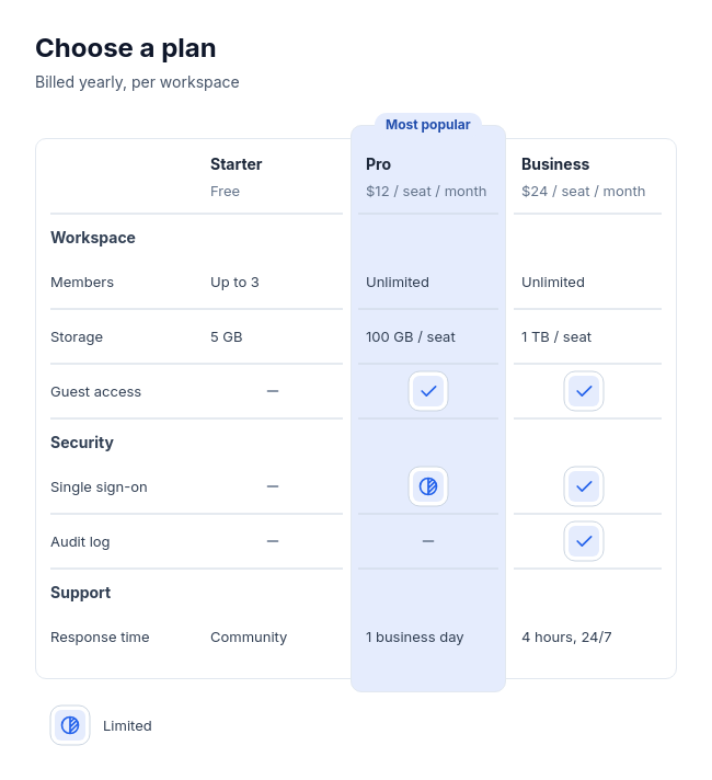 Feature tableCompare two to four plans, products, or tools feature by feature, with three to twelve rows in up to four labelled groups, and optionally one recommended option.
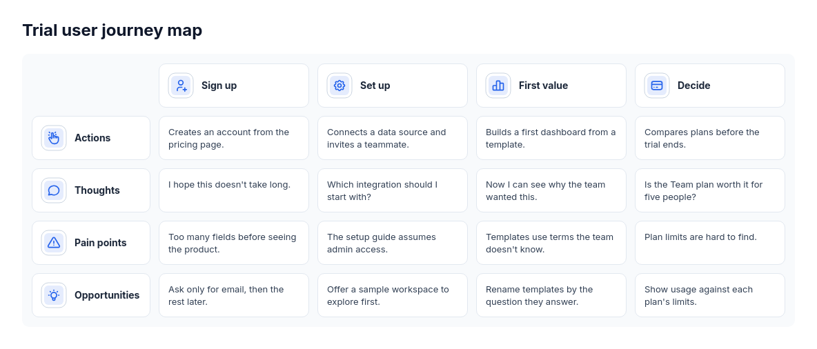 Journey mapCustomer or user journeys with stage-specific actions and observations, such as onboarding research or service design.
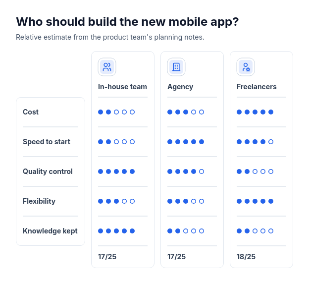 Scorecard: option column cardsCompare two or three options using supplied whole-number ratings from one to five across three to six criteria.
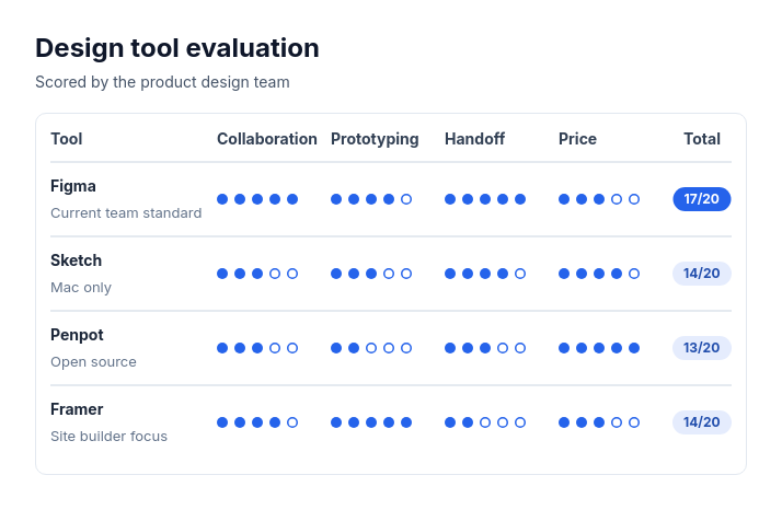 Scorecard: candidate rowsTwo to eight options, vendors, candidates, or ideas rated on the same two to five criteria with whole-number scores out of three to five.