Diagram template
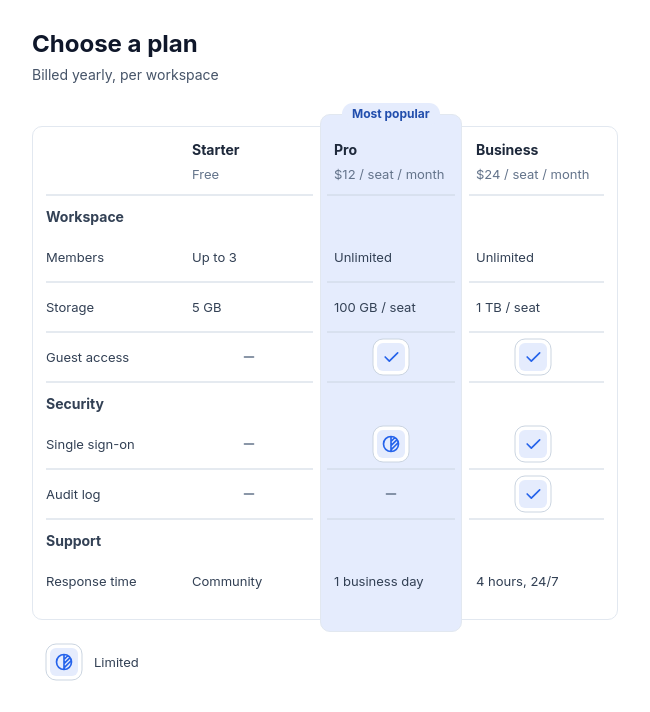
Feature table
PowerOptions across the top and grouped features down the left, with check, partial, dash, or short text cells. An optional recommendation rises above the neutral table as a tinted column with a measured label pill.
Categories
Included in
Power, Max
When to use it
Use to compare two to four plans, products, or tools feature by feature, with three to twelve rows in up to four labelled groups, and optionally one recommended option. Not for processes, timelines, one item's details, or lists of items with statuses.
Adjust after generating
Change the style, colors, and font, and these options, as often as you like without spending credits.
- Card shape
- Card border
- Card shadow
- Typography
- Icon shape
- Icon size
- Icon fill
- Icon shell
- Spacing
- Alignment
- Material
What you fill in
Describe your topic in plain words and the AI fills these in. You can edit every field afterwards.
- Columns
- 2 to 4, each with name and optional description
- Rows
- 3 to 12, each with feature and optional group
- Cells
- 6 to 48, each with row, column, kind, and optional text
- Partial label
- Text
- Highlight
- Column and label
Related templates
All table templates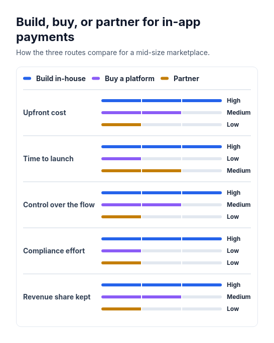 Attribute barsCompare two or three options across three to six attributes that can be scored or rated low, medium, or high, such as cost, speed, and effort.
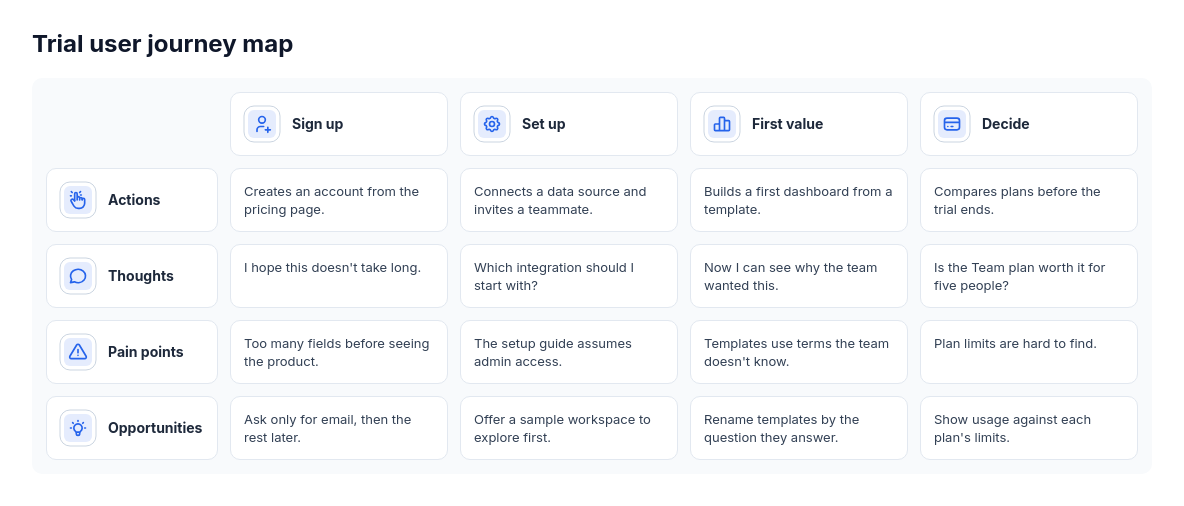 Journey mapCustomer or user journeys with stage-specific actions and observations, such as onboarding research or service design.
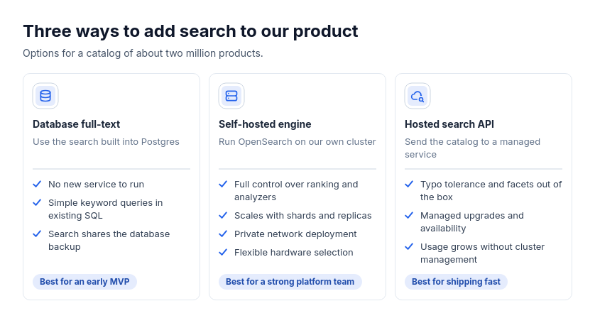 Option cardsChoosing between approaches, tools, plans, or vendors with independent strengths and optional audience guidance.
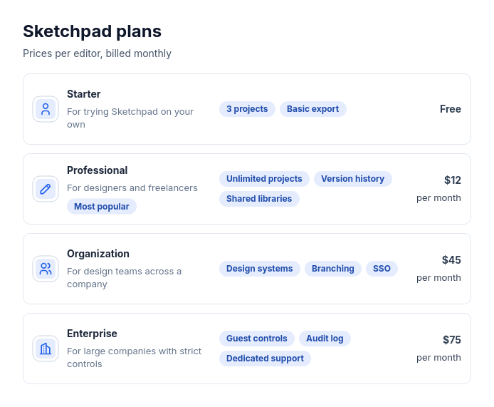 Pricing: stacked rowsTwo to five plans, memberships, or packages with a price (or none), who each is for, and a few short key features, and optionally one recommended plan.
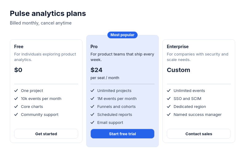 Pricing: tier cards side by sideTwo to four plans or packages of one product with a price (or none), a few included features each, and optionally one recommended plan.
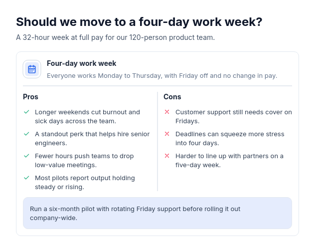 Pros and consWeigh one decision, product, approach, or choice by its advantages and drawbacks, with two to five of each and optionally a one-line verdict.