Diagram template
Attribute bars
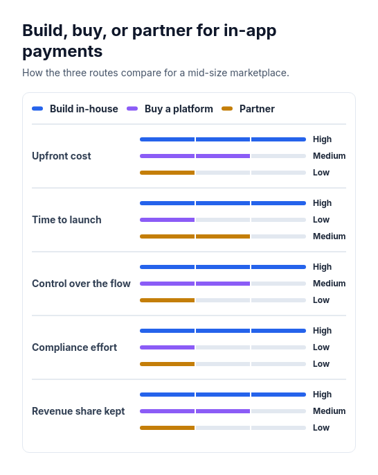
PowerA panel with a color legend above grouped horizontal bars. Each attribute has one labeled bar per option, showing either scores against a shared maximum or the ordered levels low, medium, and high.
Categories
Included in
Power, Max
When to use it
Use to compare two or three options across three to six attributes that can be scored or rated low, medium, or high, such as cost, speed, and effort. Not for yes-or-no feature lists, one option's details, processes, or timelines.
Adjust after generating
Change the style, colors, and font, and these options, as often as you like without spending credits.
- Card shape
- Card border
- Card shadow
- Typography
- Spacing
- Alignment
- Material
What you fill in
Describe your topic in plain words and the AI fills these in. You can edit every field afterwards.
- Options
- 2 to 3
- Scale
- One of levels, scores
- Score max
- Number
- Level names
- Exactly 3
- Attributes
- 3 to 6, each with name and values
Related templates
All comparison templates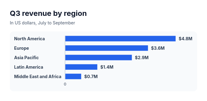 Bar chartCompare three to ten amounts of the same kind, such as sales by region, survey answers, or time per task.
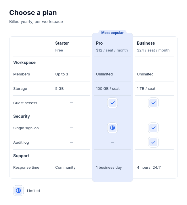 Feature tableCompare two to four plans, products, or tools feature by feature, with three to twelve rows in up to four labelled groups, and optionally one recommended option.
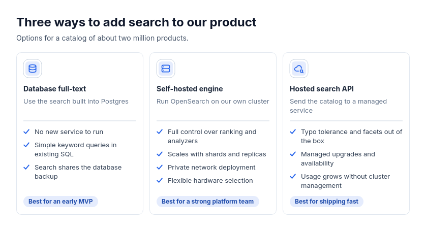 Option cardsChoosing between approaches, tools, plans, or vendors with independent strengths and optional audience guidance.
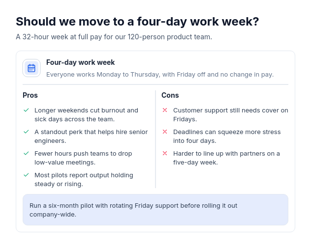 Pros and consWeigh one decision, product, approach, or choice by its advantages and drawbacks, with two to five of each and optionally a one-line verdict.
 Scorecard: option column cardsCompare two or three options using supplied whole-number ratings from one to five across three to six criteria.
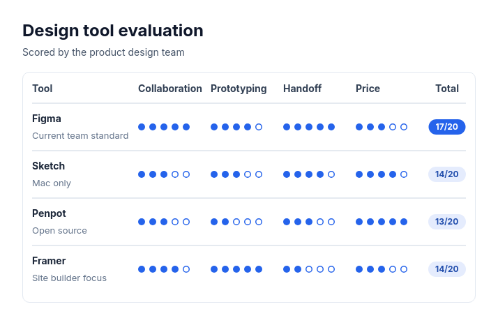 Scorecard: candidate rowsTwo to eight options, vendors, candidates, or ideas rated on the same two to five criteria with whole-number scores out of three to five.