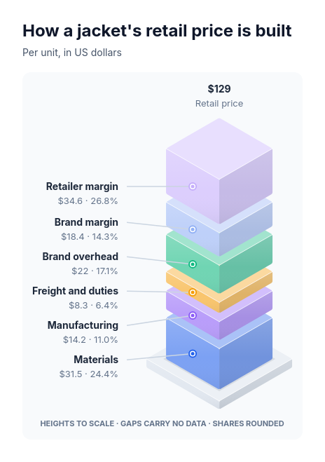
Diagram template
Stacked shares: isometric exploded tower on a plinth
MaxA single square projected tower split into two to seven floating segments with small even gaps on a low square plinth; the first part sits at the bottom and each next part stacks above it, every segment's height exactly proportional to its supplied positive amount on one scale, and an upright label column beside the tower names each part with its exact value and rounded share on a leader to its own segment, with an optional derived total and its label above the tower.
Categories
Included in
Max
When to use it
Use for one whole built up from two to seven ordered parts in one common unit, where the stacking order means something: a price built up from cost, margin and tax, the cost of a product from materials to shipping, the time budget of a process from intake to delivery, a revenue build from base to expansion, or a complete percentage breakdown in a meaningful order. The tower's footprint and the gaps between segments carry no data; only segment heights do. Not for unordered mixes (use a donut), unrelated rates, partial percentage totals, zero or negative parts, mixed quantities, changes over time or more than seven parts. Very small parts keep their exact values in their labels even when their segment is barely visible.
Adjust after generating
Change the style, colors, and font, and these options, as often as you like without spending credits.
- Typography
- Spacing
What you fill in
Describe your topic in plain words and the AI fills these in. You can edit every field afterwards.
- Prefix
- Text
- Suffix
- Text
- Total label
- Text
- Segments
- 2 to 7, each with label and value
Related templates
All chart templates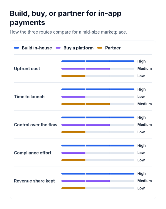 Attribute barsCompare two or three options across three to six attributes that can be scored or rated low, medium, or high, such as cost, speed, and effort.
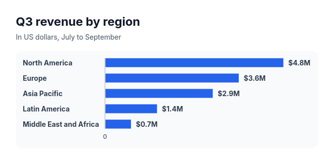 Bar chartCompare three to ten amounts of the same kind, such as sales by region, survey answers, or time per task.
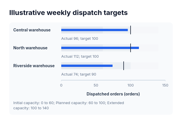 BulletActual-versus-target values sharing one nonnegative scale and explicitly supplied range boundaries.
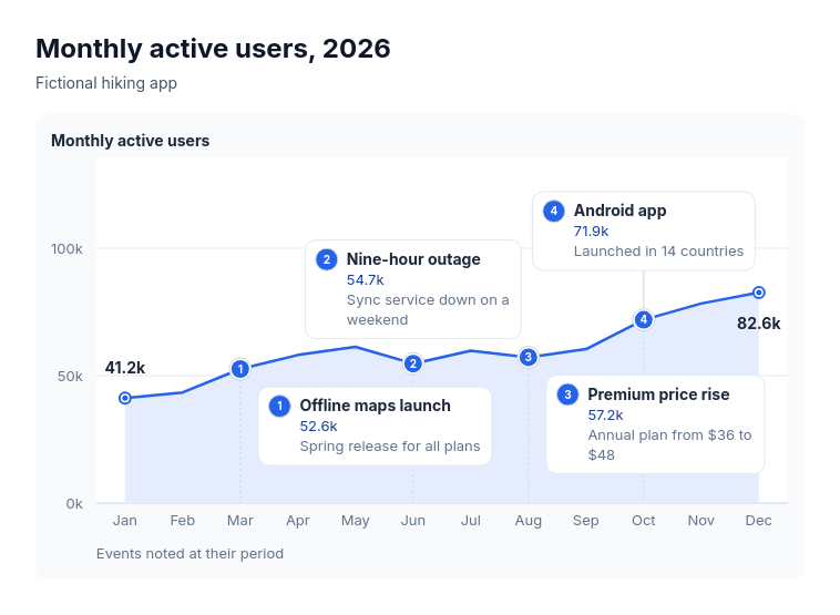 Annotated lineSuits explaining the turns in one measure over time: monthly active users with launches and outages, revenue with pricing changes, support volume with policy changes, website traffic with campaigns, headcount with reorganisations.
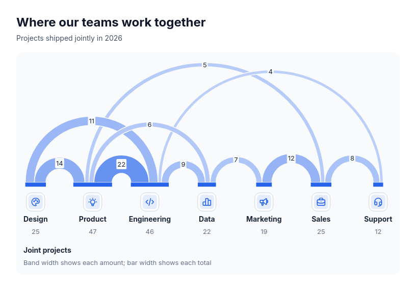 Chart: arc diagramShow how much pairs of participants share, and who is most connected, when order along a line helps: joint projects between teams, referrals between channels, cross-sell between products, trade between regions, co-authorship between groups.
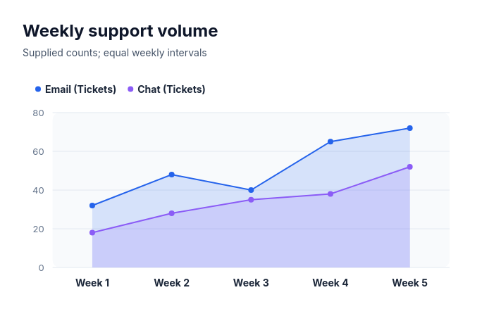 Area chartCompare 1–4 complete nonnegative series over 3–10 supplied equally spaced ordered categories as overlapping filled areas from zero, with point and line boundaries.