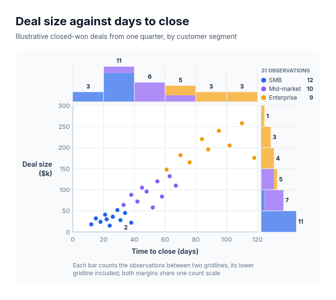
Diagram template
Chart: scatter plot
PowerEqual dots at exact numeric positions on two axes, with a histogram of the x values directly above the plot and a histogram of the y values directly to its right; the bins are the plot's own gridline intervals, so every bar spans exactly the columns or rows of dots it counts, and optional groups color the dots and stack within each bar in the same colors.
Categories
Included in
Power, Max
When to use it
Use to show how two measures relate across many observations and how each one is distributed, such as deal size against days to close by segment, delivery time against distance by region, customer tenure against monthly spend by plan, or response time against satisfaction score by channel. Needs a raw x and y value for every observation. Not for labelled individual items that each need a name, time series, aggregated or pre-binned counts, or a third measure drawn as size.
Adjust after generating
Change the style, colors, and font, and these options, as often as you like without spending credits.
- Typography
- Spacing
What you fill in
Describe your topic in plain words and the AI fills these in. You can edit every field afterwards.
- X axis
- Label and optional unit
- Y axis
- Label and optional unit
- Groups
- 2 to 4
- Nodes
- 6 to 60, each with x, y, and optional group
Related templates
All chart templates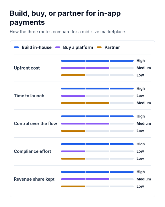 Attribute barsCompare two or three options across three to six attributes that can be scored or rated low, medium, or high, such as cost, speed, and effort.
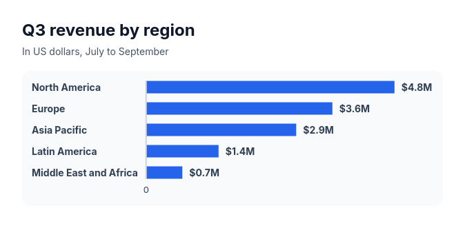 Bar chartCompare three to ten amounts of the same kind, such as sales by region, survey answers, or time per task.
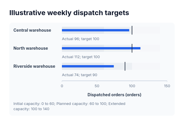 BulletActual-versus-target values sharing one nonnegative scale and explicitly supplied range boundaries.
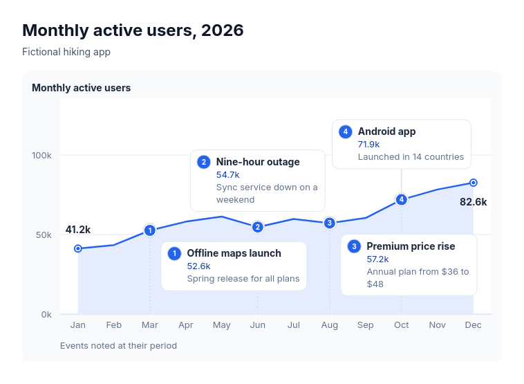 Annotated lineSuits explaining the turns in one measure over time: monthly active users with launches and outages, revenue with pricing changes, support volume with policy changes, website traffic with campaigns, headcount with reorganisations.
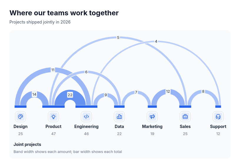 Chart: arc diagramShow how much pairs of participants share, and who is most connected, when order along a line helps: joint projects between teams, referrals between channels, cross-sell between products, trade between regions, co-authorship between groups.
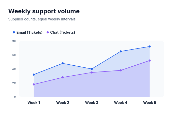 Area chartCompare 1–4 complete nonnegative series over 3–10 supplied equally spaced ordered categories as overlapping filled areas from zero, with point and line boundaries.