Diagram template
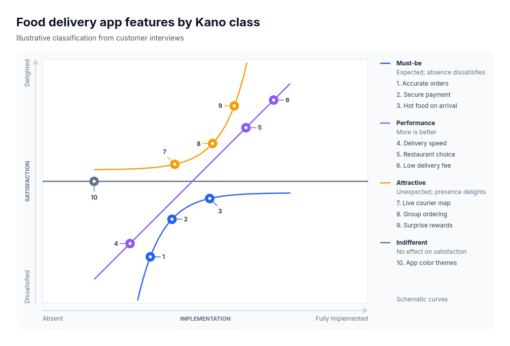
Kano model
PowerCrossed implementation and satisfaction axes carry the three fixed Kano curves: must-be, performance and attractive. 4–12 labeled features sit on the curve of their supplied class in supplied order, with indifferent features on the neutral line, and a key names each class. Numbered keys join each feature mark to its complete name in the adjacent class list.
Categories
Included in
Power, Max
When to use it
Suits classifying product features, service attributes, onboarding steps, store amenities or benefits by how their presence affects satisfaction, for product, service and customer-experience reviews. Not for measured satisfaction scores or survey results plotted as data: positions along each curve are qualitative and the curves are schematic.
Adjust after generating
Change the style, colors, and font, and these options, as often as you like without spending credits.
- Typography
- Spacing
What you fill in
Describe your topic in plain words and the AI fills these in. You can edit every field afterwards.
- Features
- 4 to 12, each with label and kind
- X axis
- Label, low, and high
- Y axis
- Label, low, and high
- Kinds
- Exactly 4, each with kind, name, and description
Related templates
All framework templates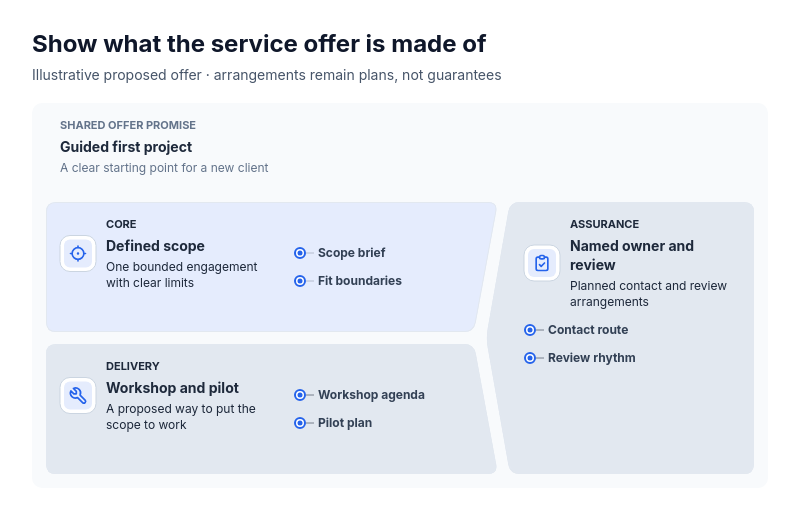 Anatomy: crowned subjectFor explaining what one thing is made of as a primary part, the part that carries it out and a part that spans both: a service offer (scope, delivery, assurance), a product (core function, how it ships, support), a course (content, format, learner support), an event (program, logistics, hosting) or a team charter (mission, ways of working, backing).
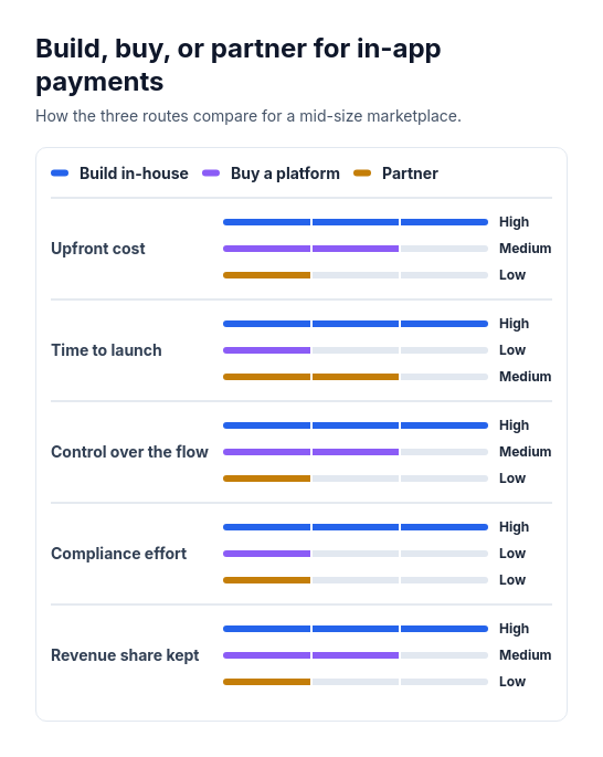 Attribute barsCompare two or three options across three to six attributes that can be scored or rated low, medium, or high, such as cost, speed, and effort.
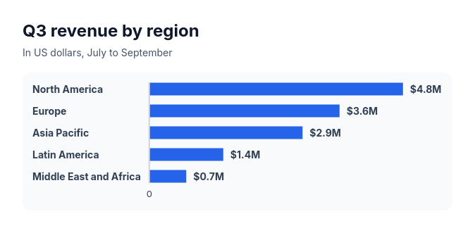 Bar chartCompare three to ten amounts of the same kind, such as sales by region, survey answers, or time per task.
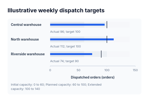 BulletActual-versus-target values sharing one nonnegative scale and explicitly supplied range boundaries.
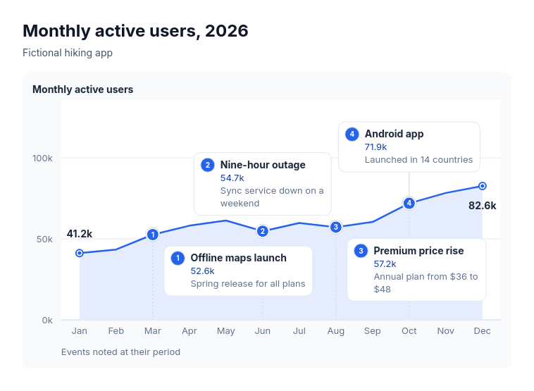 Annotated lineSuits explaining the turns in one measure over time: monthly active users with launches and outages, revenue with pricing changes, support volume with policy changes, website traffic with campaigns, headcount with reorganisations.
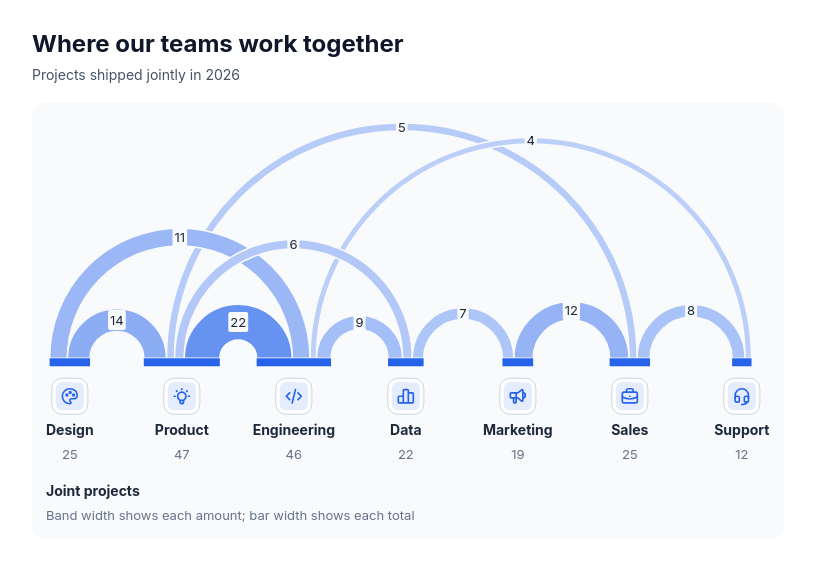 Chart: arc diagramShow how much pairs of participants share, and who is most connected, when order along a line helps: joint projects between teams, referrals between channels, cross-sell between products, trade between regions, co-authorship between groups.