Line graph maker
Create custom multi-series line graphs with categorical or time data. Handle missing values with explicit gaps, adjust Y-axis scale bounds, print blank worksheet grids, or download SVG or PNG images. Free, with no account required.
Header row: Category,Series 1,Series 2.... Leave blank cells for missing values. Up to 120 rows and 6 series.
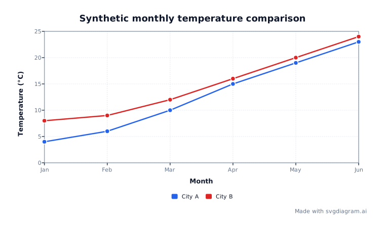
Blank line graph worksheets
Print a blank line graph grid for student exercises and plotting practice.
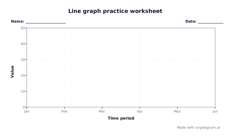 Line graph practice worksheetTime period vs. ValueOpen
Line graph examples
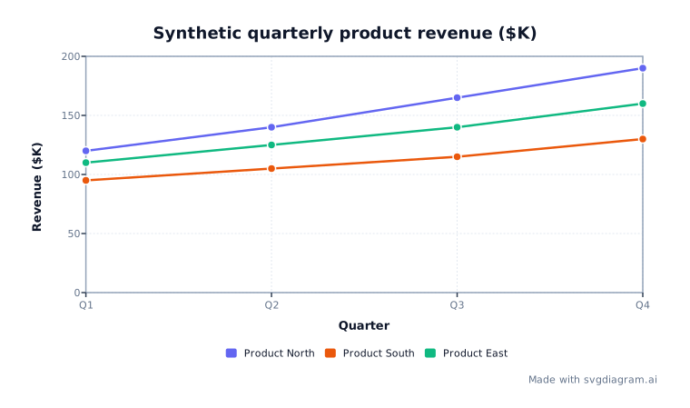
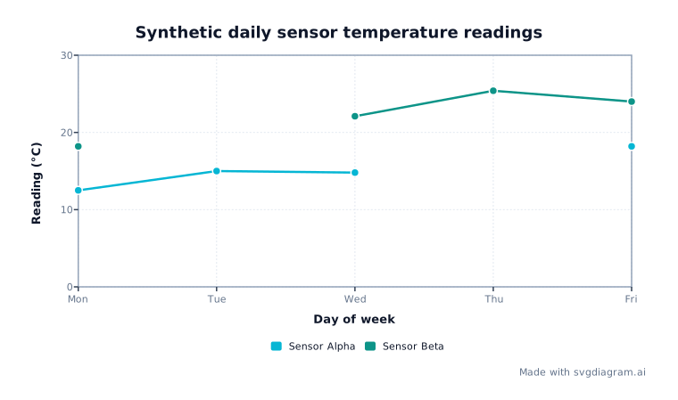
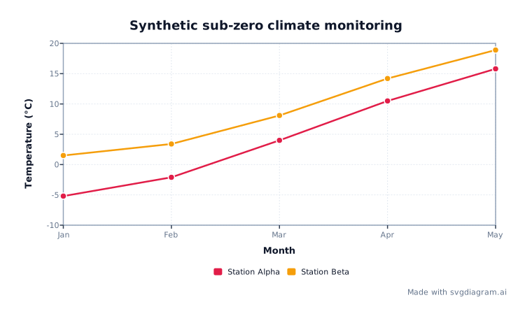
Explore worked line graph examples showing multi-series comparisons, sub-zero temperatures, and missing data gaps.
How to read a line graph
What a line graph displays
A line graph displays trends across sequential observations by connecting data points with straight line segments. Use it to visualize measurements across ordered categories or time intervals such as months, quarters, days, or experimental trials. As described in the NIST EDA Handbook, line plots emphasize direction and multi-series comparisons across ordered categories.
The horizontal X-axis shows ordered categories or time periods, while the vertical Y-axis measures numeric values. Multiple series can be plotted on the same grid to compare observations across categories.
Categorical spacing vs. scatter plots
Line graphs and scatter plots serve distinct analytical purposes:
- Categorical line graph: Categories or time labels are spaced evenly along the horizontal axis in input order. The horizontal position represents ordered category slots, not proportional numerical distances.
- Scatter plot: X and Y are both continuous numeric variables. Points are placed at exact numerical coordinates along both axes to analyze relationship patterns or mathematical model bounds.
Line graphs use straight line segments between adjacent valid points. Splines and curved interpolation are intentionally omitted because smoothing can introduce artificial intermediate values that do not exist in the source data.
Related graphing and chart tools
Explore our range of free math and statistical visualizers to analyze different data structures:
- Scatter Plot Maker – Plot numerical pairs to evaluate correlation, clusters, and regression trendlines.
- Dot Plot Maker – Visualize small numerical datasets with stacked observations over a continuous scale.
- Histogram Maker – Group continuous quantitative observations into frequency distribution bins.
- Coordinate Plane Maker – Plot geometric points, line segments, and functions across four quadrants.
Handling missing values and data boundaries
In real-world data collection, observations are sometimes missing or unavailable. This maker handles missing values clearly:
- Explicit missing gaps: When a data cell is blank, the line graph breaks the segment at that point rather than connecting across the missing observation. This tool leaves gaps for missing values to avoid drawing non-existent trends.
- Positive and negative values: The Y-axis automatically accommodates signed decimals and sub-zero values, drawing clear scale intervals.
- Data limits: Supports up to 120 categories (rows) and up to 6 distinct data series per chart.
How to create and export line graphs
- Enter or paste synthetic or user data in CSV or TSV format with a header row like
Month,City A,City B. Leave missing cells blank. - Customize the chart title, X-axis label, and Y-axis label.
- Configure manual Y-axis bounds (min, max, step) or leave them blank for automatic scale calculation.
- Toggle background grid lines, data markers, or legend display according to your presentation requirements.
- Select a color palette, font family, and text size, or switch to worksheet mode for printable student practice sheets.
- Export high-resolution SVG or PNG images for reports, presentations, or classroom assignments.
Explore other diagram types
Templates for each type, filled in from a description of your content.