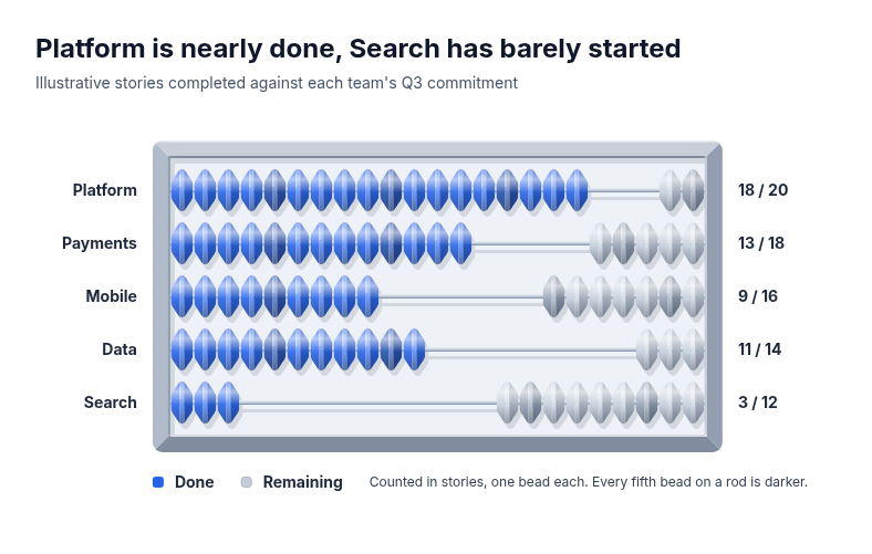
Diagram template
Abacus
Three to six rows drawn as the rods of one framed abacus. Each rod carries exactly as many faceted beads as the row's supplied total on one shared bead pitch: the done beads sit in the accent against the left of the frame, the remaining beads stay neutral against the right, and bare rod separates them. Every fifth bead on a rod is darker so the runs count quickly. Row names sit left of the frame, done and total counts right, with a key below.
Categories
Included in
Max
When to use it
Suits small whole-number progress compared across a few rows, where each unit should stay countable: sprint or quota progress by team, seats filled by course, orders picked by warehouse, checklist items completed by site. Needs a whole done count and a whole total of at most 20 per row in one unit. Not for large totals, percentages without counts, or parts of one whole: use a bar or bullet chart for large amounts and a waffle for shares of one total.
What you fill in
Describe your topic in plain words and the AI fills these in. You can edit every field afterwards.
- Unit
- Text
- Value label
- Text
- Remaining label
- Text
- Rows
- 3 to 6, each with label, value, and denominator
Related templates
All chart templates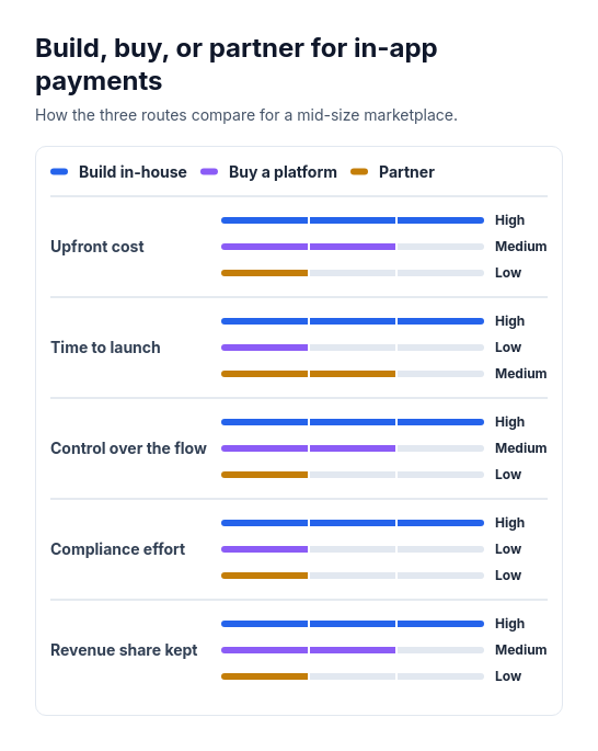 Attribute barsCompare two or three options across three to six attributes that can be scored or rated low, medium, or high, such as cost, speed, and effort.
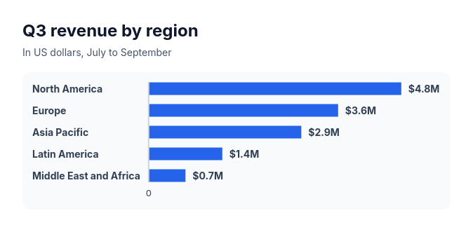 Bar chartCompare three to ten amounts of the same kind, such as sales by region, survey answers, or time per task.
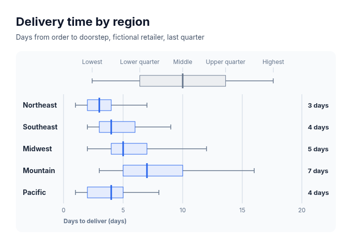 Box plotSuits comparing how values spread across groups when five summary numbers are known for each: delivery times by region, salaries by level, deal sizes by segment, response times by team, test scores by class.
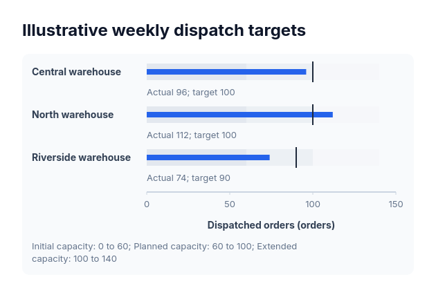 BulletActual-versus-target values sharing one nonnegative scale and explicitly supplied range boundaries.
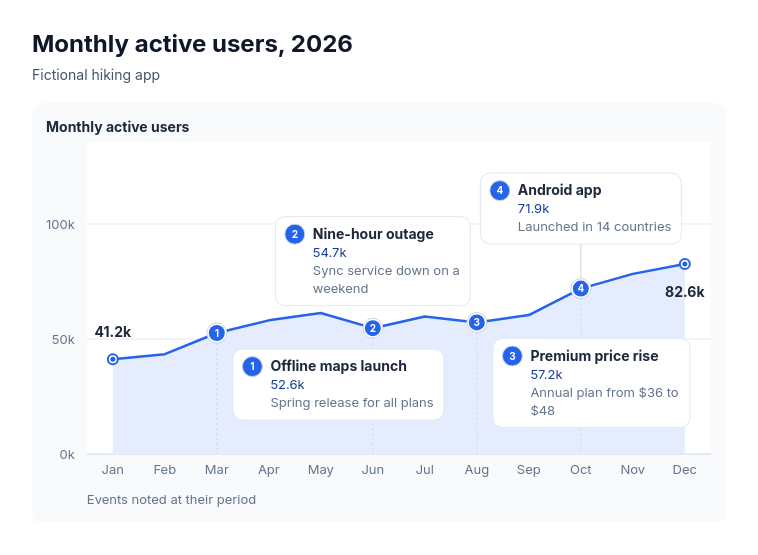 Annotated lineSuits explaining the turns in one measure over time: monthly active users with launches and outages, revenue with pricing changes, support volume with policy changes, website traffic with campaigns, headcount with reorganisations.
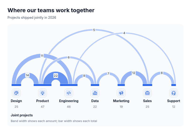 Chart: arc diagramShow how much pairs of participants share, and who is most connected, when order along a line helps: joint projects between teams, referrals between channels, cross-sell between products, trade between regions, co-authorship between groups.