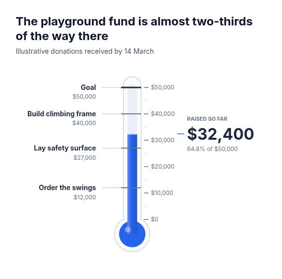
Diagram template
Goal thermometer
Progress toward one goal drawn as a glass thermometer. The column rises from the bulb to the supplied value on a ticked scale that runs past the goal, the goal and up to four supplied milestones are marked on the left at their own levels, and the amount reached is the headline on the right, level with the top of the column, with its derived share of the goal.
Categories
Included in
Max
When to use it
Suits one running total against one goal, the classic fundraising thermometer: donations raised, signatures collected, sales against quota, sign-ups before a launch, savings toward a purchase. Needs a value and a goal in one unit, with optional milestones on the way. Not for several measures, a value that can be negative, or change over time: use a bullet chart, fill-level cylinders or a line chart. Milestones must be far enough apart on the scale to draw distinct marks.
What you fill in
Describe your topic in plain words and the AI fills these in. You can edit every field afterwards.
- Prefix
- Text
- Suffix
- Text
- Value label
- Text
- Value
- Number
- Target label
- Text
- Target
- Number
- Milestones
- 1 to 4, each with label and value
Related templates
All chart templates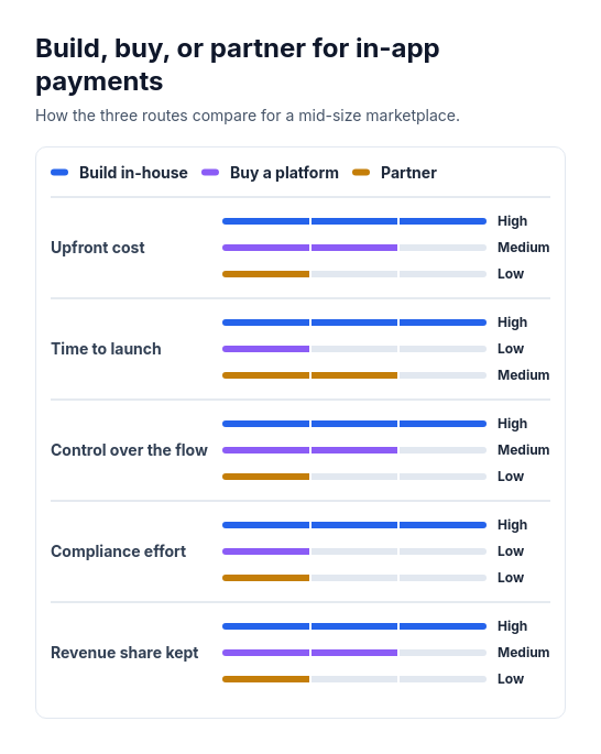 Attribute barsCompare two or three options across three to six attributes that can be scored or rated low, medium, or high, such as cost, speed, and effort.
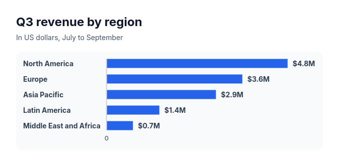 Bar chartCompare three to ten amounts of the same kind, such as sales by region, survey answers, or time per task.
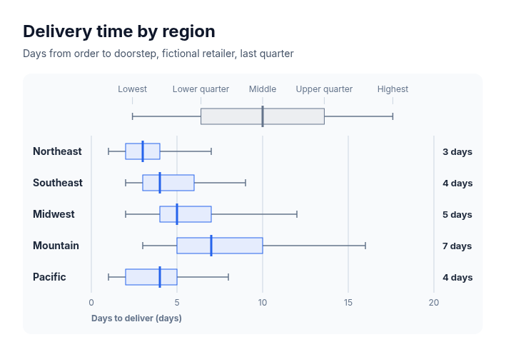 Box plotSuits comparing how values spread across groups when five summary numbers are known for each: delivery times by region, salaries by level, deal sizes by segment, response times by team, test scores by class.
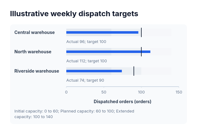 BulletActual-versus-target values sharing one nonnegative scale and explicitly supplied range boundaries.
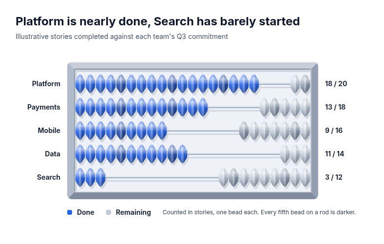 AbacusSuits small whole-number progress compared across a few rows, where each unit should stay countable: sprint or quota progress by team, seats filled by course, orders picked by warehouse, checklist items completed by site.
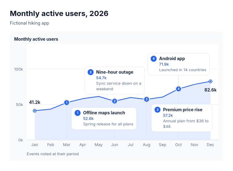 Annotated lineSuits explaining the turns in one measure over time: monthly active users with launches and outages, revenue with pricing changes, support volume with policy changes, website traffic with campaigns, headcount with reorganisations.